We've be fortunate to be selected as one of the Artisans to be part of the 2017 One of a Kind Show (OOAKS) in Toronto. We will be putting together some posts in the weeks following the show to share some of the challenges and experiences we encountered in both applying and preparing for our very first OOAKS. In the meantime, if you are planning on attending the upcoming show, we have a sweet promo code to share with you.
If you purchase your tickets online, use the promo code ETJ3NMXG (all caps) to get tickets for only $12 versus the $15 at the door. For full information about OOAK show, purchasing tickets, and seeing the full artisan list click here.
Showing posts with label backyard paper company. Show all posts
Wednesday, 15 March 2017
Wednesday, 11 November 2015
Pens for Lettra
Today we had a great question come to us via twitter from Kelani Irene (@KIFN) about which pens are best for writing on Crane Lettra. At Backyard we are frequent users of ball point pens and have typically used them - like thousands, if not millions of others - to write on our letterpressed card with no real issue (other than them dying on us mid-word). So,to try and help Kelani out, we gathered up a small sample of pens with different tips and nibs to showcase potential differences of their inky impressions on lettra cotton rag.
Here are the writing candidates (right to left in photo):
1) Straedtler Norica 132 46 HB2 pencil - freshly sharpened.
2) Bic Ultra Round Stic Grip - our daily user
3) Uni Jetstream - our secondary daily user
4) Straedtler Pigment Liner 0.3
5) Sharpie twin tip - fine tip used here
6) Prismacolour 005
7) Bic Velocity
8) Pentel Brush pen
Sorry no fountain pen on hand - but maybe we'll update this list to include it in the future.
And here are the results:
As you can see most of the pens we had on hand wrote very well on the smooth cotton surface of the lettra. The Straedtler Pigment Liner 0.3 (4th line "a test of pens"), Sharpie twin tip (6th line "on lettra"), and Pentel Brush pen (last line "what fun!") appeared to have more 'bleeding' into the paper, but nothing to make the writing incomprehensible. The lettra seems to absorb these felt tip, more ink saturated pen types.
Our personal choice is the old fashion trusted ball point, like the Bic Ultra Round Stic Grip and Uni Jetstream, or the Straedtler Pigment Liner for a deeper black . However, saying that, we have by no means presented an exhaustive list of pens. If you have any suggestions of pens (or other writing implements for that matter) to try out we are happy oblige. So send us an email with your pen suggestions. Ultimately though it's not what you use to write with, rather the sentiments written that will hit the mark.
Hope we guided you a little Kelani in choosing a pen for your lettra letterpress paper needs.
Happy letterpressing!!
Here are the writing candidates (right to left in photo):
1) Straedtler Norica 132 46 HB2 pencil - freshly sharpened.
2) Bic Ultra Round Stic Grip - our daily user
3) Uni Jetstream - our secondary daily user
4) Straedtler Pigment Liner 0.3
5) Sharpie twin tip - fine tip used here
6) Prismacolour 005
7) Bic Velocity
8) Pentel Brush pen
Sorry no fountain pen on hand - but maybe we'll update this list to include it in the future.
And here are the results:
As you can see most of the pens we had on hand wrote very well on the smooth cotton surface of the lettra. The Straedtler Pigment Liner 0.3 (4th line "a test of pens"), Sharpie twin tip (6th line "on lettra"), and Pentel Brush pen (last line "what fun!") appeared to have more 'bleeding' into the paper, but nothing to make the writing incomprehensible. The lettra seems to absorb these felt tip, more ink saturated pen types.
Our personal choice is the old fashion trusted ball point, like the Bic Ultra Round Stic Grip and Uni Jetstream, or the Straedtler Pigment Liner for a deeper black . However, saying that, we have by no means presented an exhaustive list of pens. If you have any suggestions of pens (or other writing implements for that matter) to try out we are happy oblige. So send us an email with your pen suggestions. Ultimately though it's not what you use to write with, rather the sentiments written that will hit the mark.
Hope we guided you a little Kelani in choosing a pen for your lettra letterpress paper needs.
Happy letterpressing!!
Labels:
awesome,
backyard paper company,
Bic,
greater toronto area,
gtaletterpress,
letterpressyyz,
lettra,
Mississauga,
Neenah Paper,
pens,
Pentel,
Primascolour,
Sharpie,
Staedtler,
twitter,
Uniball
Friday, 6 November 2015
The letterpress card upgrade
There are some great cards in our collection that we originally produced through digital or silk screen printing processes. These include such favorites like our holiday venn diagram cards and our recent glow in the dark creations. These were originally designed with letterpress intentions, but with our excitement and eagerness, produced them by other means to share our joy when letterpress wasn't a viable option.
But that was yesterday!!
Today these cards are getting the upgrade they were made for - printed on 100% cotton rag lettra, smashed with VanSon custom mixed inks and lovingly press by our hand fed C&P. There's just no matching letterpress!!!
There are quite a few cards getting the upgrade and we are ridiculously excited for them to be printed in the fashion for which they were designed. We will be posting pictures via twitter and adding posts to the blog as we go through the stack. So, look forward to seeing some oldies getting a letterpress face-lift in the next couple weeks and all of them will be added to our shop just in time for the holiday season.
Happy letterpressing!!
Friday, 23 October 2015
We missed you internets!
Well Hello Hello!!
It may have come to your attention that we have been on a hiatus for quite some time. You may have thought we disappeared, or maybe something bad had happened, or even worse - that we forgot about you, our dear internet friends!
Don't fret friends - we haven't forgot about you. How could we you devilishly wonderful peeps! We have simply been in a state of constant transition over the last year. You may have read our previous post that we were moving to Ontario way back in October 2014. Well that happened and we found ourselves in the beautiful city of Pickering. Though Pickering was wonderful for us with its beautiful fall foliage, sandy beaches, and plethora of Starbucks in close proximity, our slew of letterpress equipment just wasn't 'feeling it' (ie. we just didn't have a space to operate our equipment). So, in February of 2015, we made the move to Mississauga, Ontario, where we have found a wee studio space in which we finally moved all our letterpress equipment in to. With all that moving it has taken us nearly 8 months to get settled, unpack all our pressessories (letterpress accessories), set up our new space, and get back to business. In fact, we are still in the process of getting our main C&P up and running due to some damaged incurred during transit. But we are happy to say, that at least for now we can begin to concentrate or returning to business as usual - even if the transition may continue to be slow.
So it's great to see you once again internets! We missed you a whole bunch and can't wait to post some great new things in the upcoming weeks and months as we get back up to speed.
Happy letterpressing!!
Friday, 5 December 2014
Glow in the Coasters
With all the excitement of using glow in the dark inks, we recently produced some glow in the dark paper coasters too. These ones are inspired by some classic glasswares we had around the house that we used for storing homemade jams. Each set contains 6 hand drawn images containing classic Kerr, Ball, Dominion, Ideal, Bernadine and Crown glass jars. We hand silk screened each one using gold and custom mixed glow in the dark inks.
Friday, 21 November 2014
Glow in the dark cards
It's a been a few months since we've shared a post about some of our recent work. We added some sneak peaks and images to our twitter account when we made these new items, but sometimes is not the most adequate forum to showcase the designs and process.
Posted below are some of our new cards and designs. Though we often look to designs for letterpress printing, we sometimes forget to acknowledge that screen printing doesn't stray far from ours hearts. And, if you are familiar with both screen printing and letterpress design, you can recognize some similarities in process despite using vastly difference equipment and producing very different aesthetics.
For some of our recent cards, we decided to hand silk screen them in limited numbers. The reason for this was that we got a hold of some glow in the dark paints, something you just can't seem to find for letterpress, and, you know, we just had to try them. So, our design and colour wizard, Shauna, had the awesome idea of using the glow inks as the base and mixing in some other colours. That way you get the hit of colour while maintaining that kid inspired happiness of still glowing in the dark!!
![]() |
| This entire card is glow in the dark! Making sure your thanks are also visible in the dark |
| Simple two colour screen print. The electric eels glow in the dark. How shocking! |
Wednesday, 8 October 2014
Fritzler-Krueger Wedding
We recently completed our most extensive wedding package ever! This included save the dates, invites, maps, reply cards, reception cards, and even letterpressed envelopes. Wow!!
These invites were for the lovely and effervescent young couple Megan Fritzler and Dustin Krueger. These beautiful people came into our studio with a an inspired visions, an unrelenting enthusiasm for letterpress, and a yellow floral chair (more on this in a minute). Although they knew what they wanted in their invitation suite and the vibe they wanted to convey, they came to us to design all the elements to capture their vision, all inspired by a vintage floral chair. I wish we still had a photo of the chair - recent computer issues has resulted in that photo being lost forever - but it is similar to this one (but in bright shades of yellow and gold).
We hand sketched a pattern from this vintage chair and used it as the centrepiece for all the elements. Also, because Megan and Dustin were so awesome in giving us the liberty to try new things, we decided to make this a four colour - that's right four colour - design. If this wasn't complicated enough already though, we hand mixed all one of a kind colours. These invites may have been labour intensive, but we believe they came out beautiful!! Have a look and tell us what you think. Big congrats go out to Megan and Dustin! You two are amazing and we truly appreciate letting us be part of your wedding extravaganza. Wishing you both a lifetime of love, laughter and happiness.
These invites were for the lovely and effervescent young couple Megan Fritzler and Dustin Krueger. These beautiful people came into our studio with a an inspired visions, an unrelenting enthusiasm for letterpress, and a yellow floral chair (more on this in a minute). Although they knew what they wanted in their invitation suite and the vibe they wanted to convey, they came to us to design all the elements to capture their vision, all inspired by a vintage floral chair. I wish we still had a photo of the chair - recent computer issues has resulted in that photo being lost forever - but it is similar to this one (but in bright shades of yellow and gold).
We hand sketched a pattern from this vintage chair and used it as the centrepiece for all the elements. Also, because Megan and Dustin were so awesome in giving us the liberty to try new things, we decided to make this a four colour - that's right four colour - design. If this wasn't complicated enough already though, we hand mixed all one of a kind colours. These invites may have been labour intensive, but we believe they came out beautiful!! Have a look and tell us what you think. Big congrats go out to Megan and Dustin! You two are amazing and we truly appreciate letting us be part of your wedding extravaganza. Wishing you both a lifetime of love, laughter and happiness.
![]() |
| The Final Product |
| The design and polymer plates all ready to hit the press |
| Laying down the first two custom colours for the reception and map portions of the invitations |
| Laying down the first two custom colours for the invites, reply cards and accommodations cards |
| Using our Pantone colour swatches to get just the right colours |
| Adding in the third custom colour layer |
| The fourth custom colour layer for the reception and map portions of the invites |
| Here you can see the before and after the fourth colour was added |
| Fourth colour added to the reception cards |
| The completed invitation card |
| The completed reply cards and reception invitations |
Friday, 4 July 2014
Light Box Display Sign
Materials List
1- 24in x 24in Sureply board
1 - 1x2x96in (8ft long) lumber
20 - 1-3/4in screws
2 - 24in LED light strips (we used these)
2 - AA battery packs (we used these)
1 - electrical switch (like this)
1- 24 x 12in piece of aluminum foil - can use multiple smaller pieces but enough to cover the 24x12in surface area
wood glue
soldering iron with flux
coloured tissue paper
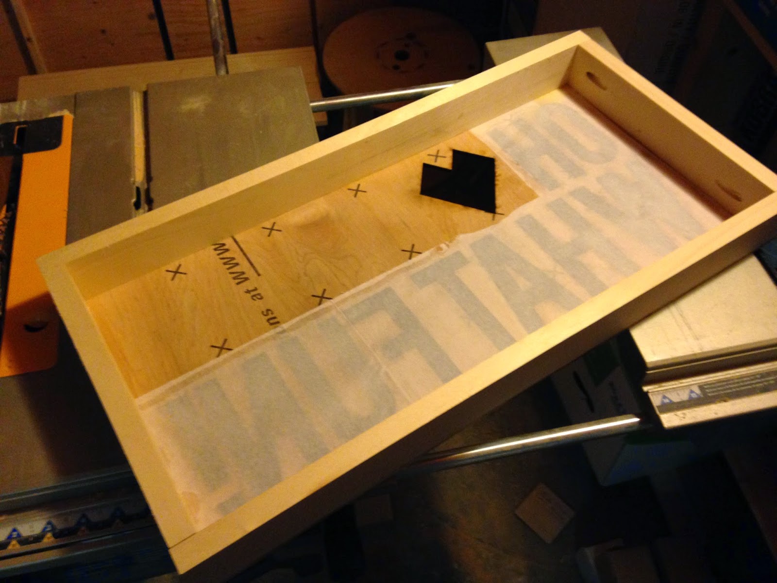
We first cut the sureply into two - 24x12in pieces - one panel will be the front, the second will be the back of the completed light box. We then created a design with the same dimensions (24x12) and had it laser cut into one of the wood panels. The nice thing about using sureply is it's really sturdy and has a wonderfully smooth finished side which can either be used for a wood finished look, or can be easily painted later on.
Now add your coloured tissue paper to the back of the laser cut front panel. Using the wood glue, brush out a light outline around the design and adhere the tissue paper to back. The tissue paper does not have to be cut precisely, but it shouldn't overlap anywhere visible on the front side.
| Wood glue used to adhere the white tissue paper to the lettering portion on the back of the front panel |
| View from the front once the white tissue paper was glued on the backside of the front panel |
| Cutting down the 8ft 1x2 |
| The two 1x2x12in pieces cut |
| The box frame adhered to the back of the front panel. |
Screw the sides of the box frame together. We used a Kreg jig to create pocket holes so the screws would not be visible from the exterior of the box (you can see them in the previous photo on the short 1x2x10.5in side piece). Use the wood glue and clamps to adhere the box frame to the back of the front panel. If you plan to paint the front panel, you can use finishing nails on the front of the front panel to further reinforce the box frame to the front panel.
While the glue is setting, glue the aluminum foil to the other 24x12in sureply panel - your back panel. For best results make sure the shiny side of the aluminum foil is face outwards.
| Aluminum foil, shiny side out, glued to the back panel |
Now for a bit of the complicated stuff - wiring the lights. We used the ones from Walmart since we don't know a whole lot about wiring LED lights ourselves. The nice thing about these ones is that the package already comes prewired with a switch and battery pack. However the switch does not stay one automatically and the battery pack consists of a small 9volt pack. This is insufficient for longer duration of constant use.We followed the same wiring pattern from the package, but replaced the battery wiring going to the 9volt pack with the two AA battery packs and soldered together in serial. We also replaced the package light switch with a manual flip switch. Again, we followed the wiring pattern and soldered in our new switch in place. The LED light strip also has an adhesive back, which makes mounting the lights super simple. With the wiring complete, add the lights to the bottom and top of your light box, with the lights facing the back panel.
| LED strip lights mounted |
| we hot glued the excess wires to the back of the front panel |
| The soldered wires, battery packs and switch for the lights |
| Our switch box with the battery packs mounted |
We built a small switch box to mount the batteries to. This isn't necessary. You could mount the battery packs to the inside of the box, but we wanted easy access to change batteries as needed. Once you have all the lights mounted, and wires soldered, check to see if they all work. Now, place the back panel on, enclosing the light box using the 1-3/4in screws. Pre drill the holes, as the screws may cause your box frame to split.
| Finished product |
| Finished product with lights on. |
This was a very fun project that was a little outside of our normal operations. Hope this post is helpful to brightening up your displays as well.
Monday, 10 February 2014
Super Strong Magnets
In our backyard we make magnets. Not just any magnets, but super strong magnets that feature original illustrations. And each one is hand pressed with parts hand fabricated right in our own studio.
Some people have asked us, "How strong are your super strong magnets?" To answers this common question, we made a really quick and dirty video.
Subscribe to:
Posts (Atom)